Sizing
I don't know if you've noticed, but when we moved our cards to external
divs serving as columns in the grid, they stopped having the
same height.
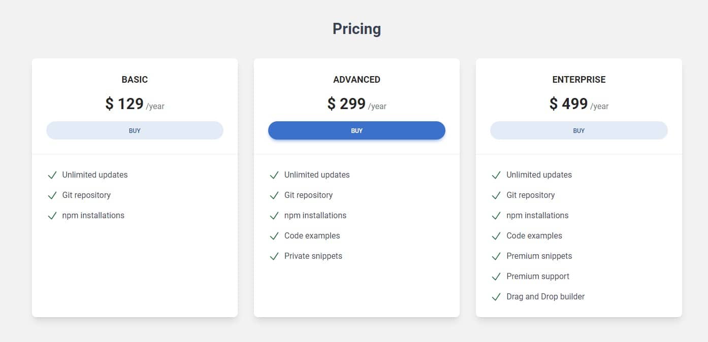
This is how it looked when the cards served as columns at the same time:

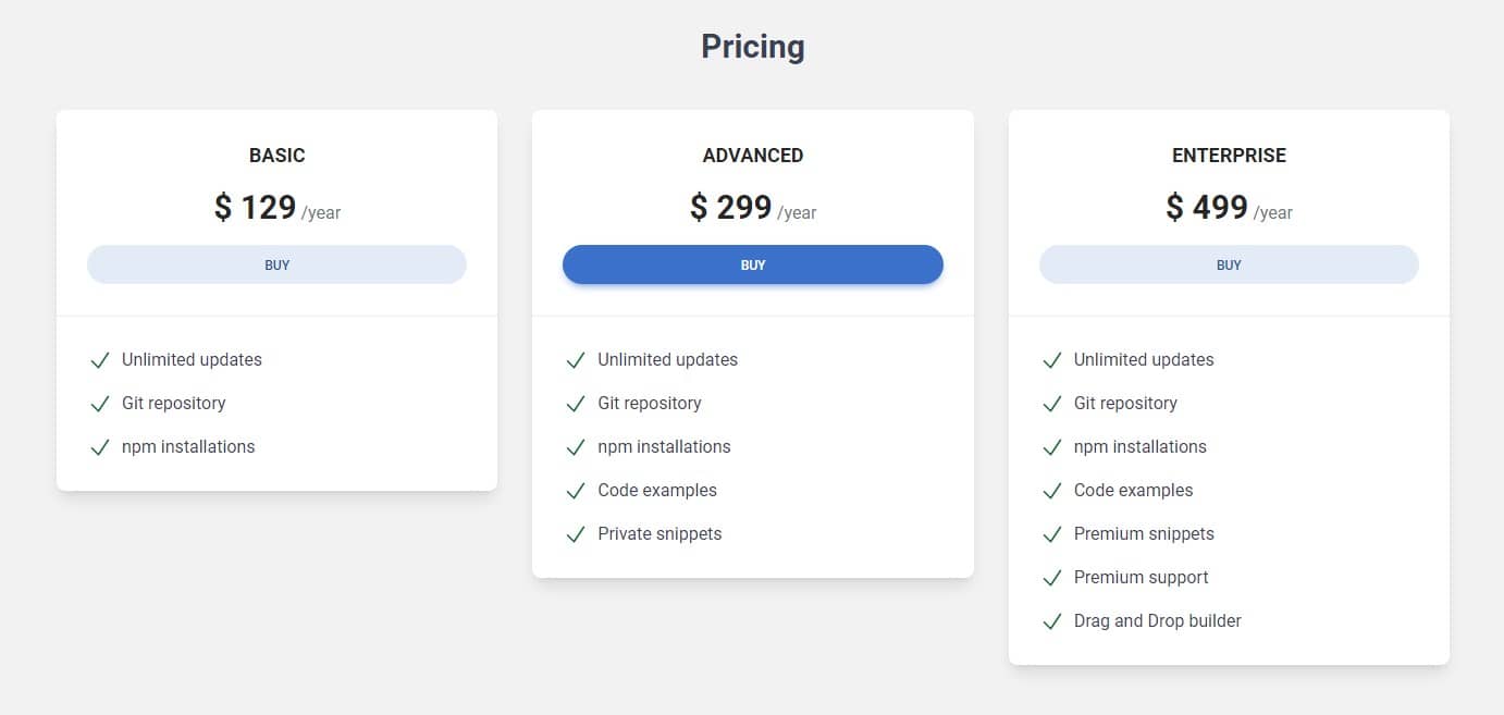
By default, the card's height is defined by its content (that is, the card's
height will adjust to the amount of content you add to it) so this is what
it looks like now that we've moved the columns to the outer
divs:

This is because only elements that are direct children of the grid have their height set to 100%.
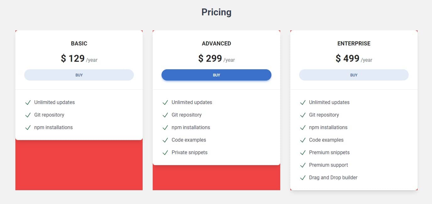
And if we add the .bg-red-500 class to the columns to make them
visible, we see that they are actually still stretched to their full
available height and are equal to each other.

It would be good to make the cards still the same height. This is a good opportunity to talk about sizing utilities.
Width
Width is controlled using the w prefix followed by a unit or
value.
    <!-- .w-1 sets the width to 0.25rem (1/4 of the base rem size). -->
    <div class="w-1"></div>

    <!-- .w-2 sets the width to 0.5rem (1/2 of the base rem size). -->
    <div class="w-2"></div>

    <!-- .w-3 sets the width to 0.75rem (3/4 of the base rem size). -->
    <div class="w-3"></div>

    <!-- .w-4 sets the width to 1rem (base rem size). -->
    <div class="w-4"></div>

    <!-- .w-6 sets the width to 1.5rem. -->
    <div class="w-6"></div>

    <!-- .w-8 sets the width to 2rem. -->
    <div class="w-8"></div>

    <!-- .w-10 sets the width to 2.5rem. -->
    <div class="w-10"></div>
The pattern continues up to .w-96 for 24rem, and
then there are some specific larger sizes:
.w-1
.w-2
.w-3
.w-4
.w-6
.w-8
.w-10
Relative to the parent
However, the most useful are relative sizes, where we can set the height or width relative to the parent:
    <!-- .w-full sets the width to 100% -->
    <div class="w-full"></div>

    <!-- .w-1/2 sets the width to 50% -->
    <div class="w-1/2"></div>

    <!-- .w-1/3 sets the width to 33.33333% -->
    <div class="w-1/3"></div>

    <!-- .w-2/3 sets the width to 66.66667% -->
    <div class="w-2/3"></div>

    <!-- .w-1/4 sets the width to 25% -->
    <div class="w-1/4"></div>

    <!-- .w-2/4 sets the width to 50% -->
    <div class="w-2/4"></div>

    <!-- .w-3/4 sets the width to 75% -->
    <div class="w-3/4"></div>

    <!-- .w-1/5 sets the width to 20% -->
    <div class="w-1/5"></div>

    <!-- .w-2/5 sets the width to 40% -->
    <div class="w-2/5"></div>

    <!-- .w-3/5 sets the width to 60% -->
    <div class="w-3/5"></div>

    <!-- .w-4/5 sets the width to 80% -->
    <div class="w-4/5"></div>

    <!-- .w-screen sets the width to 100vw (full width of the viewport) -->
    <div class="w-screen"></div>
Height
Height works the same way as width, but instead of w we use
h prefix
    <!-- .h-full sets the height to 100% -->
    <div class="h-full"></div>

    <!-- .h-1 sets the height to 0.25rem (1/4 of the base rem size). -->
    <div class="h-1"></div>

    <!-- .h-1/2 sets the height to 50% -->
    <div class="h-1/2"></div>

    <!-- .h-10 sets the height to 2.5rem. -->
    <div class="h-10"></div>

    <!-- And so on... -->
Step 1 - set cards to full height
Let's set the cards to full height. We'll do this by adding the
h-full class to the divs with our pricing cards.
    <!-- Card basic -->
    <div
      class="h-full rounded-lg bg-white text-center shadow-lg dark:bg-neutral-700">
      [...]
    </div>
    <!-- Card basic-->
Do the same with the other two cards and after saving the file, you should see that the cards are now the same height.


About author
Michal Szymanski
Co Founder at TW Elements and MDBootstrap / Listed in Forbes „30 under 30" / Open-source enthusiast / Dancer, nerd & book lover.
Author of hundreds of articles on programming, business, marketing and productivity. In the past, an educator working with troubled youth in orphanages and correctional facilities.