Key concepts
Let's briefly discuss the topics that we will cover in this course.
Tailwind CSS
Tailwind CSS is a highly customizable, utility-first CSS framework designed for rapidly building modern and responsive web interfaces. It offers a unique approach to styling by providing a vast array of low-level utility classes that can be easily combined to create unique designs without writing custom CSS.
Its greatness lies in its ability to promote fast development, consistency across projects, and ease of maintenance, allowing developers to focus on creating visually appealing and functional user experiences with minimal effort.
TW Elements
You can look at TW Elements as Tailwind on steroids.
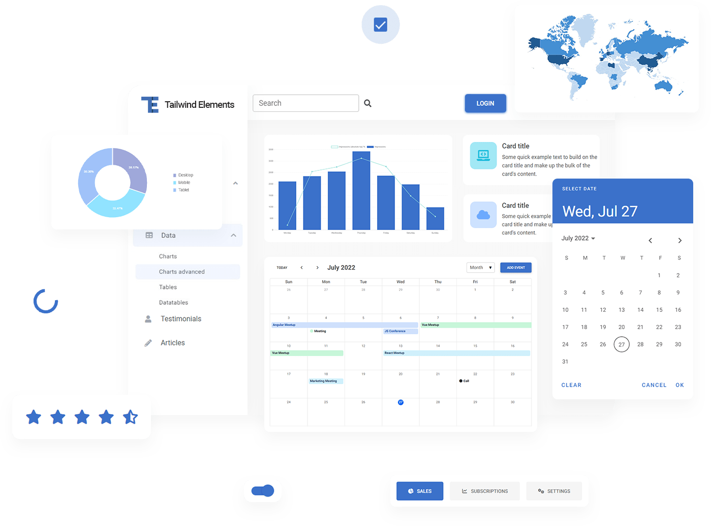
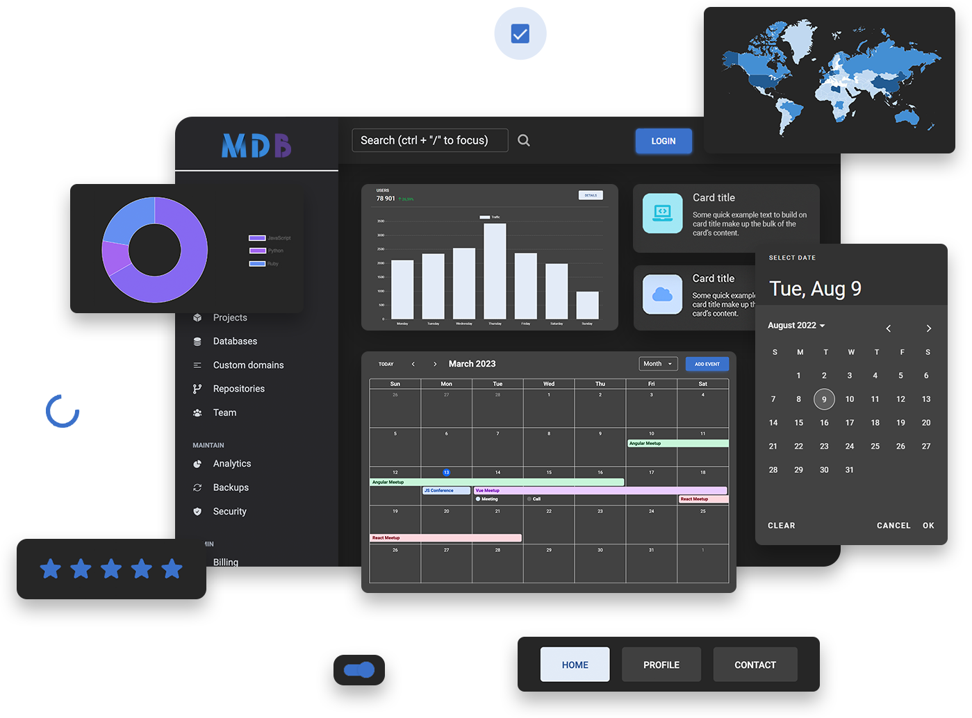
TW Elements provides you with:
- Tens of additional quality components, design blocks & templates
- Stunning design system called Material Minimal
- Interactivity in components such as dropdowns, modals, carousels, greyhounds and many others
- Integration with the most popular JavaScript libraries, such as React, Angular, Vue or Svelte
- Integration with the most popular backend technologies such as Node.js, PHP and many more
- Dozens of high-quality, free tutorials (like the one you're reading right now)
- Playground, where you can freely experiment with the code directly in your browser
- Integration with MDB GO and MDB CLI, i.e. free hosting and an open-source deployment platform, thanks to which you can publish your website for free on the Internet in a few seconds
- Much, much more that you will learn in this course
Responsive web design a.k.a. RWD
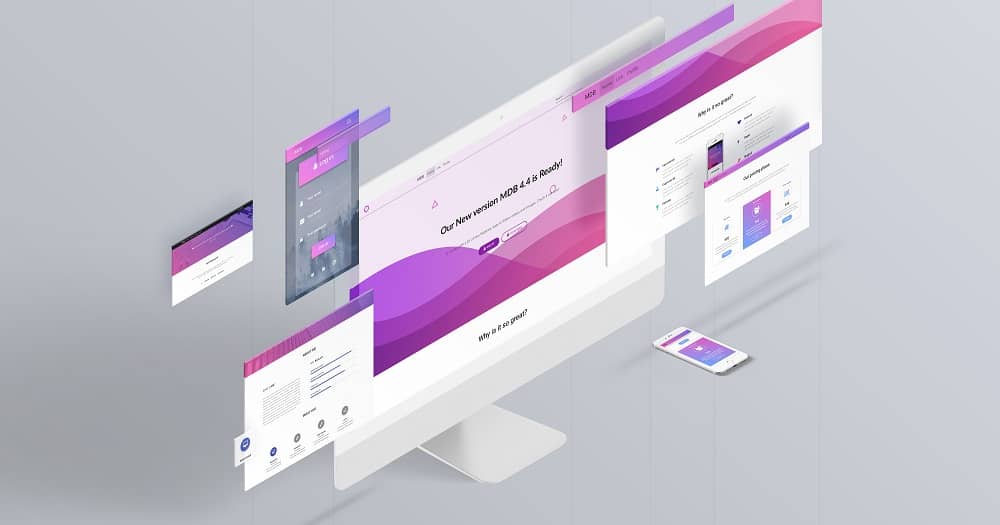
This is an approach in web design, which assumes that a website or a web application should display correctly and work efficiently on all screens and devices - regardless of the screen size, manufacturer or model.
Material Design
As I mentioned above, Material Design is a design language made by Google. You certainly know him from Android and many Google applications.
According to the official Material Design website:
"Material is the metaphor"
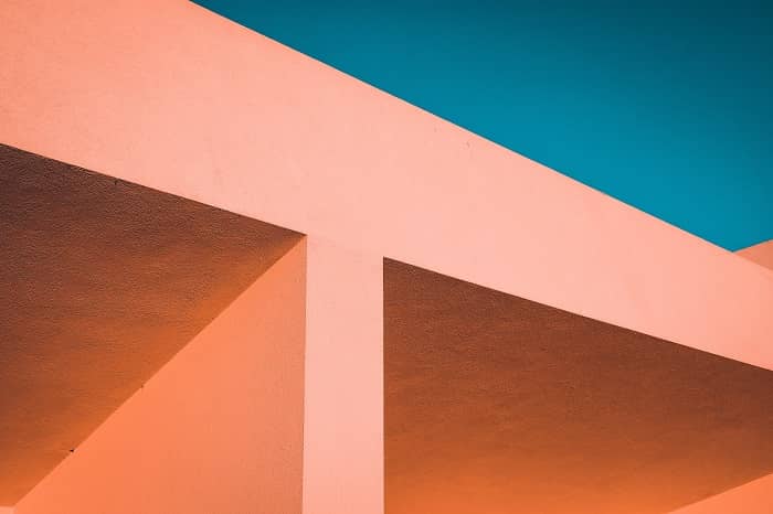
"Material Design is inspired by the physical world and its textures, including how they reflect light and cast shadows. Material surfaces reimagine the mediums of paper and ink."
Real-life objects
Digital Material Design objects
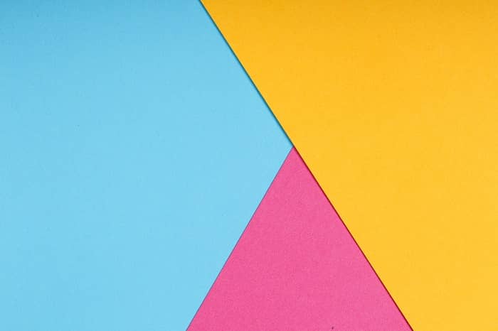
Classic Material Design component
For many years, we have tried to follow the Material Design guidelines as closely as possible. However, as time went on, we began to see more and more aspects that could be improved.
Classic Material Design can be heavy, clunky and monotonous. Fortunately, with the release of Material Design 3, Google changed its approach to its guidelines.
"The latest version of Material Design (v.3) includes personalization and accessibility features that put people at the center"
In other words - use the best in Material Design, but at the same time personalize and adapt it to your needs.
We takes full advantage of this principle by creating its own, improved version of Material Design, i.e. Material Minimal.
Material Minimal
Material Minimal design system, is an improved version of the classic Material Design.
On the one hand, Material Minimal appreciates and uses the standard created by Google, and on the other hand improves it, giving it lightness, subtlety and elegance.
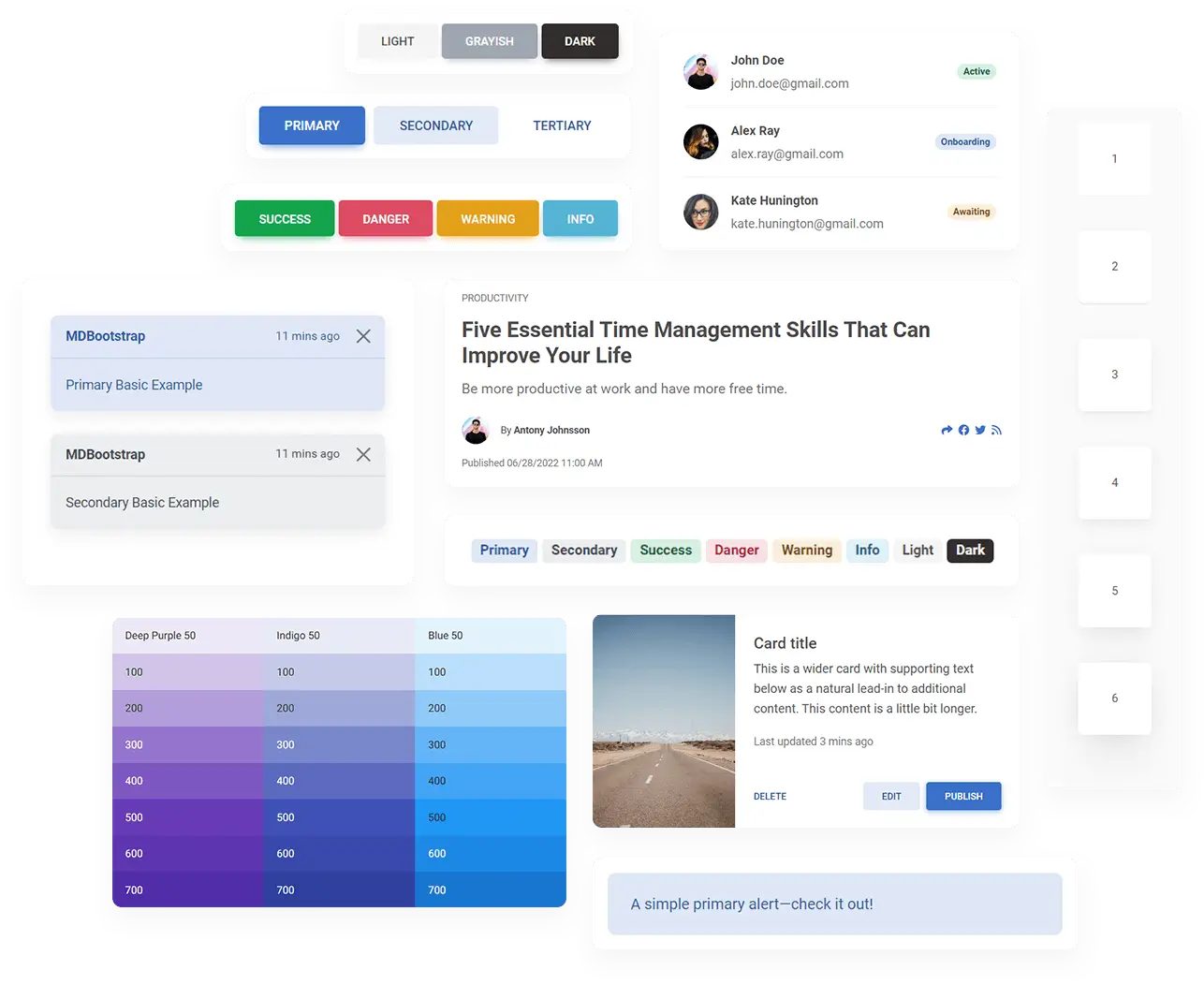
The foundations of the MDB design system are three core values.
Material Minimal is:
Natural
Material Minimal is inspired by the physical world and its textures, including how they reflect light and cast shadows. Material surfaces reimagine the mediums of paper and ink. This value is proudly inherited from Material Design.
Clear
It's a style that needs to breathe. It loves space and lightness. Minimalist and clean in form, it is supposed to prevent the user from feeling overwhelmed and confused. Material Minimal wants to be the stage where the content is the main actor.
Scalable
It grows with your project. A clear hierarchy and strict rules from the very beginning lay a solid foundation so that the UI is able to provide an excellent user experience, even when its complexity increases significantly.
These values are reflected in some of the most important principles:
- Accessibility and usefulness as fundamental principles
- Clear hierarchy of elements and colors
- Clear contrast
- Subtle shadows (often smudged with color)
- Gently rounded corners in the components
- Focus on details
- Bright backgrounds (however, full dark mode is welcome)
- Extensive whitespace
- Big, readable headings
- Clear and accessible typography
- Real-life photography
- Limited use of effects
UI & UX design
The two terms are often used together, although they mean different things. However, the relationship between them is so close that it's hard to talk about one without touching the other.
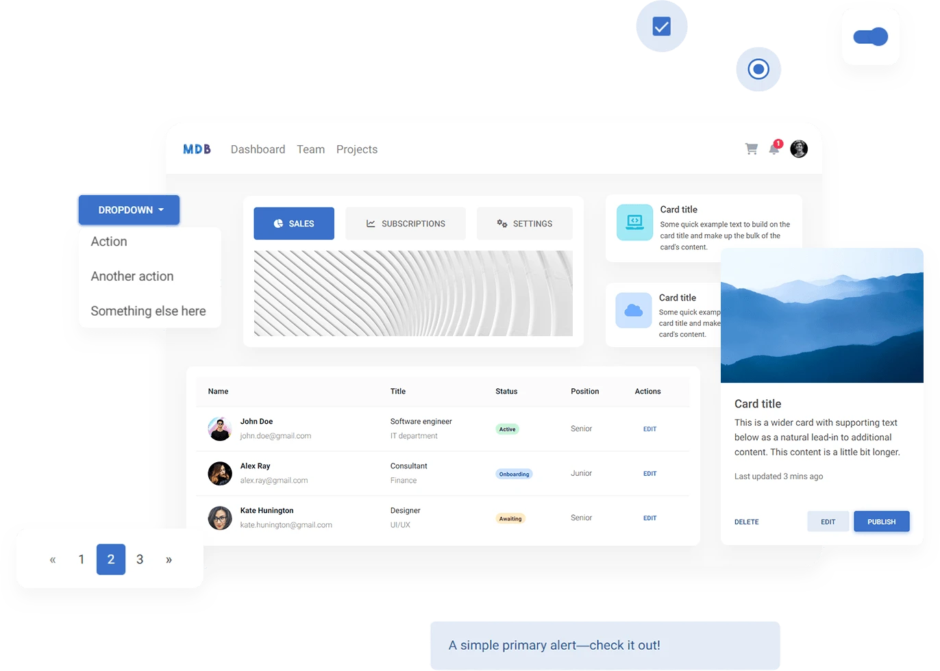
UI design means "User Interface design" and UX design means "User Experience design."
The main goal of UI design is to create a visually appealing and easy-to-navigate interface.
The main goal of UX design is to design the best possible user experience. This means that the product should be functional, accessible and fun to use.
MDB GO
MDB GO is a powerful platform, that offers free hosting and open-source deployment tool.
In short, thanks to MDB GO you can publish your website on the internet for free in just a few clicks. In addition, MDB GO provides you with:
- Free hosting for your apps, websites & databases
- WordPress blog & eCommerce with 1 click
- Frond-end & back-end templates
- Custom domains & SSL
- SFTP & CLI
- ...and many more
Okay, that's enough theory. It's time to roll up your sleeves and jump into the code!

About author
Michal Szymanski
Co Founder at TW Elements and MDBootstrap / Listed in Forbes „30 under 30" / Open-source enthusiast / Dancer, nerd & book lover.
Author of hundreds of articles on programming, business, marketing and productivity. In the past, an educator working with troubled youth in orphanages and correctional facilities.