Simple Hero Section Example
Screenshot
Get the code

Hero Section Image
Screenshot
Get the code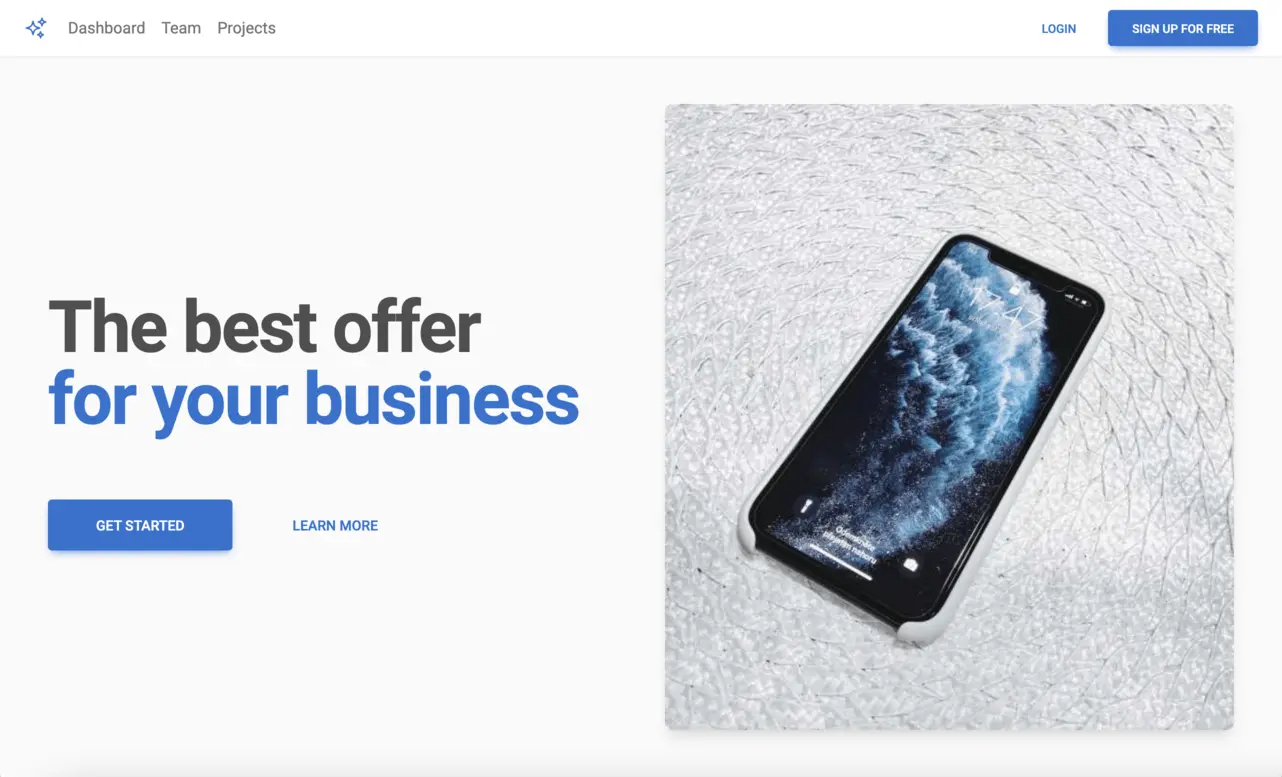
Hero Sign Up Form
Screenshot
Get the code

Hero Background Image
Screenshot
Get the code

Hero Section Pattern
Screenshot
Get the code

Hero Section Card
Screenshot
Get the code

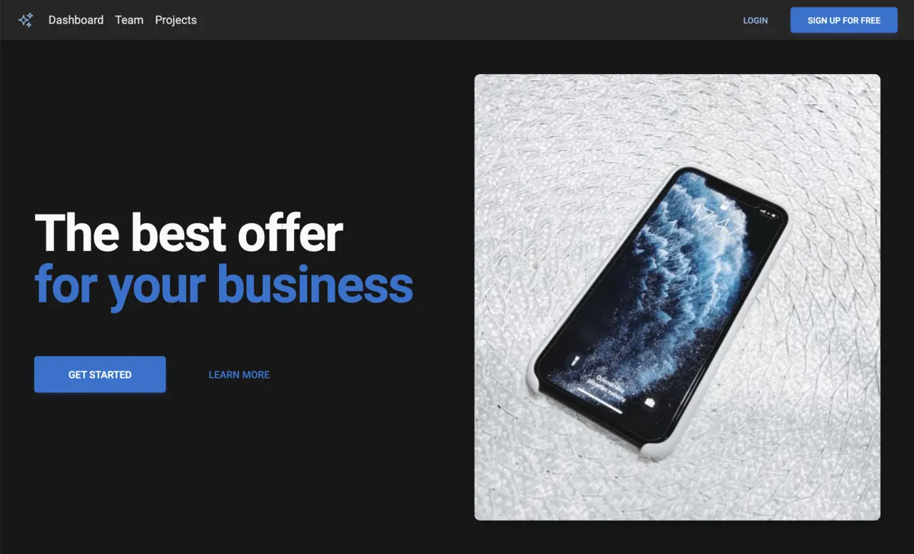
Dark Hero Section
Screenshot
Get the code

Dark Background Sign Up Form
Screenshot
Get the code

Curved Bottom Background Image
Screenshot
Get the code

Background Image with Card
Screenshot
Get the code

Hero Section Page
Screenshot
Get the code

Hero Section Video
Screenshot
Get the code