Top quality
Tailwind React UI Kit
Bootstrap components recreated with Tailwind CSS and React, but with better design and more functionalities
- 500+ UI components
- Super simple, 1 minute installation
- Easy theming and customization
- Free hosting


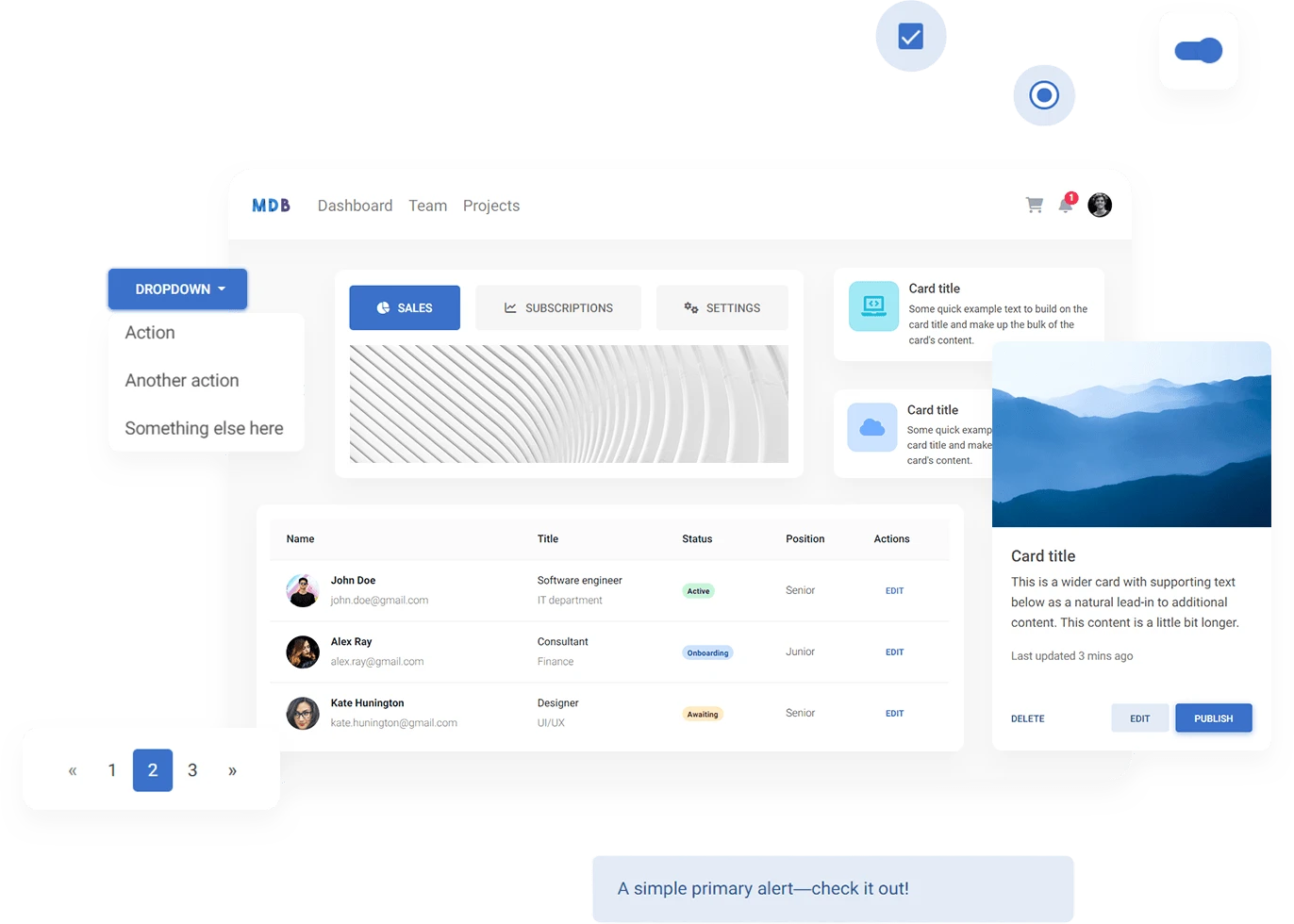
Key components that will save your time
Open source license
A collection of stunning components made with attention to the smallest details. Forms, cards, buttons, and hundreds of others - in Tailwind Elements React you will find all the essential elements necessary for every project.

Easy theming
Dark mode and custom themes
With TW Elements, adding a dark mode to your project is child's play. Using tailwind's classes in combination with a dark variant you can easily integrate any website with two themes. We have included the dark theme variant by default in all our components!
In addition, as in any tailwind project, it is possible to customize the default theme by overwriting project's color palette, type scale, fonts, breakpoints, border radius values, and more via tailwind.config.js configuration file.


A design system that will make your projects stand out
Elegant, subtle and classy
Tired of the default Material Design, but still want to use the potential of a Google standard? The TW Elements design system, called Material Minimal, is the perfect choice for you – it combines the best of Material Design, but adds subtlety, elegance and a unique taste to it.


Customize whatever you want
Powerful and simple API
Components, navigation, forms – TW Elements provides an easy-to-use API that allows you to customize everything according to your needs and taste.
We enable class customization of all elements nested inside advanced components. The same goes for options and even icons. We give full freedom to choose a set of icons in the project. You can even select several different libraries and our components will display any icon easily.


Community support
Our joint work and passion
Our source code is publicly available, as is project management. We are grateful for every submitted issue or feature request. Thanks to this, we can constantly develop and improve the quality of our UI KIT, together with you!


Use MDB GO - Free hosting & deployment tool
Publish with a single command
-
Step 1
Create a free account
30 seconds, a few clicks, and it's done.
If you already have an account on mdbootstrap.com you don't need to register, you can just use that.
-
Step 2
Install the MDB CLI
Open your terminal and install the MDB CLI globally by entering the command below.
npm install -g mdb-cli -
Step 3
Log in
Enter the following command in the terminal, and then log in using your details from step 1.
mdb login -
Step 4
Publish your project to the internet
In the terminal, go to the folder where your project is located. Then enter the command below, accept or fill in your project's options and it's ready! After a few seconds, your project will be available on the Internet. And yes, it is that simple.
mdb publish
This is just the beginning of the adventure. To find out about all the possibilities, go to the getting started page.
Coming soon
Templates, Builder, Tutorials, new Design Blocks, new Components
We are planning to release new elements and improvements in the upcoming future as well as try to launch this project on sites like Product Hunt.
We will be honored if you decide to leave your email address in order to keep in touch and support us in this.
Waiting list
