TW elements is a plugin that extends the functionality of the library with many interactive components.
In some dynamic components (like dropdowns or modals) we add custom JavaScript. However, they do not require any additional installation, all the necessary code is always included in the example and copied to any Tailwind project - it will work.
TW elements formats
TW elements, in order to meet the new, modular approach, allows the use of
ES and UMD formats. These formats will differ in
the way components are initialized and will be used in different cases.
When to use ES or UMD format?
If your application:
- is based on
modules - uses
bundlerfunctionality - needs
treeshaking
the ES format will be most suitable for you, otherwise
UMD is the way to go.
What is the difference between TW elements ES and UMD formats?
In short, the way to initialize components. In order to allow bundlers to
perform proper treeshaking, we have moved component initialization to the
initTWE method. TW elements in UMD format will
work without adding more elements, but will lack treeshaking. TW Elements
in ES format, on the other hand, allows components to be used
as separate modules, resulting in the much smaller build size.
About the initTWE method
To use the initTWE method, you need to import it from the
tw-elements, same as for components. You can provide a second
argument that will be an object with options that you want to pass to the
init method. The options object can contain the following properties:
-
allowReinits- by default it's value is set tofalse. By changing the value totrue, theinitTWEmethod won't check if components were already initialized. It can be helpful for example when using theTW elementspackage with frameworks that use routing (for example Vue SPA) -
checkOtherImports- by default the value is also set tofalse. How does it work? IfinitTWEfinds a component that should be inited but has not been passed as an argument (for example, it finds a data attribute that would suggest that it should be initialized automatically), it will display a warning in a console. We encourage to use it in the last invocation ofinitTWEmethod because it shows what inits are lacking at the current moment.
How to use the initTWE method?
Import the method from the tw-elements package inside your
project js file and call it with the components you want to
initialize.
    import { Input, initTWE } from "tw-elements";
    initTWE({ Input }, { allowReinits: true });
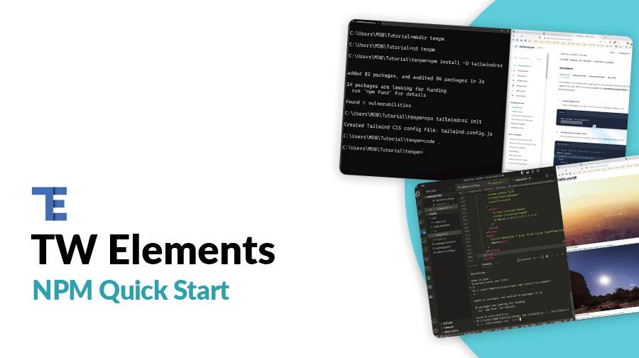
NPM
NPM is a recommended way to work with TW elements and others libraries.
Make sure that you have Node.js installed. In order to
verify that, open a command line and type
node -v. If node is installed you should see it's version
in a console.
1. Before starting the project make sure to install Node.js (LTS) and TailwindCSS.
2. Run the following command to install the package via NPM:
npm install tw-elements
3. TW elements is a plugin and should be included inside
tailwind.config.js. It is also recommended to extend the
content array with a js files pattern that loads dynamic
component classes. The final version of the config file should look like
this:
  module.exports = {
    content: [
      "./src/**/*.{html,js}",
      "./node_modules/tw-elements/js/**/*.js"
    ],
    plugins: [require("tw-elements/plugin.cjs")],
    darkMode: "class"
  };
4. Include the following JavaScript file before the end of the body element. Keep in mind that the path to the file may be different depending on the file structure of your project.
    <script
      type="text/javascript"
      src="../node_modules/tw-elements/dist/js/tw-elements.umd.min.js"></script>
Now, the library is ready to use and available via the global
twe variable.

MDB GO / CLI
Create, deploy and host anything with a single command.
1. To start using MDB GO / CLI install it with one command:
npm install -g mdb-cli
2. Log into the CLI using your MDB account:
mdb login
3. Initialize a project and choose TW elements from the list:
mdb init tailwind-elements
4. Install the dependencies (inside the project directory):
npm install
5. Run the app:
npm start
6. Publish when you're ready:
mdb publish

Vite
Node.js version 16.17.0 + / 18.1.0 + installed. Please
update if your package manager asks for it. If you are expecting issues
with vite.config.js and you don't want to update the npm,
try using the 4.3.9 version of vite.
Vite (French word for "fast", pronounced /vit/) is a build tool that aims to provide a faster and leaner development experience for modern web projects. TW elements can be imported in Vite applications according to the following procedure:
1. Create a new vite project and enter the newly created directory. Pick
Vanilla framework and JavaScript variant. You can
skip this step if you already have it installed.
  npm create vite@latest my-project
  cd my-project
2. Install tailwind CSS and its dependencies. After that,
init the tailwind with the Tailwind CLI tool to create
tailwind.config.js file.
  npm install -D tailwindcss postcss autoprefixer
  npx tailwindcss init -p
3. Go to the tailwind.config.js file and add paths where your
html files are going to be stored. You can change the
index.html location but make sure to change to
root folder
inside the vite.config.js file.
  /** @type {import('tailwindcss').Config} */
  module.exports = {
    content: [
      "./index.html",
      "./src/**/*.{js,ts,jsx,tsx}",
    ],
    theme: {
      extend: {},
    },
    plugins: [],
  }
4. Add the necessary Tailwind directives to your style.css file
to be able to use Tailwind classes on your website. Unless you changed it,
style.css should be in the root directory of your app. You can
also remove the default content of the style.css file if you
want.
    @import url("https://fonts.googleapis.com/css?family=Roboto:300,400,500,700,900&display=swap");
    @tailwind base;

    @layer base {
      html {
        @apply text-surface;
        @apply bg-white;
      }
      html.dark {
        @apply text-neutral-50;
        @apply bg-body-dark;
      }
    }

    @tailwind components;
    @tailwind utilities;

    p {
      @apply leading-[1.6];
    }
5. Link the css file inside the index.html.
    <head>
      ...
      <link rel="stylesheet" href="style.css" />
      ...
    </head>
6. Tailwind should be connected properly to the vite app. If you type the
code bellow, you will see the default vite index.html page
(without any styles if you deleted them from style.css).
npm run dev
7. Install the tw-elements package.
npm install tw-elements
8. Add js files patterns that loads dynamic component classes to the content
array inside the tailwind.config.js. Extend the default
tailwind classes by adding the TW elements plugin.
  /** @type {import('tailwindcss').Config} */
  module.exports = {
    content: [
      "./index.html",
      "./src/**/*.{html,js}",
      "./node_modules/tw-elements/js/**/*.js",
    ],
    plugins: [require("tw-elements/plugin.cjs")],
    darkMode: "class"
  };
9. Now you can start working on your app. Since the package.json created by
vite has a type set to module, we are going to use the
ES. Lets try to import some code and see if everything is
working correctly. Don't forget to call the initTWE method. The
carousel component should have proper styles, and change the current image
after arrow click or after some delay.
initTWE({ Carousel, Tooltip, Input });
    <body class="dark:bg-neutral-800">
      <div
        id="carouselExampleCaptions"
        class="relative"
        data-twe-carousel-init
        data-twe-carousel-slide>
        <div
          class="absolute bottom-0 left-0 right-0 z-[2] mx-[15%] mb-4 flex list-none justify-center p-0"
          data-twe-carousel-indicators>
          <button
            type="button"
            data-twe-target="#carouselExampleCaptions"
            data-twe-slide-to="0"
            data-twe-carousel-active
            class="mx-[3px] box-content h-[3px] w-[30px] flex-initial cursor-pointer border-0 border-y-[10px] border-solid border-transparent bg-white bg-clip-padding p-0 -indent-[999px] opacity-50 transition-opacity duration-[600ms] ease-[cubic-bezier(0.25,0.1,0.25,1.0)] motion-reduce:transition-none"
            aria-current="true"
            aria-label="Slide 1"></button>
          <button
            type="button"
            data-twe-target="#carouselExampleCaptions"
            data-twe-slide-to="1"
            class="mx-[3px] box-content h-[3px] w-[30px] flex-initial cursor-pointer border-0 border-y-[10px] border-solid border-transparent bg-white bg-clip-padding p-0 -indent-[999px] opacity-50 transition-opacity duration-[600ms] ease-[cubic-bezier(0.25,0.1,0.25,1.0)] motion-reduce:transition-none"
            aria-label="Slide 2"></button>
          <button
            type="button"
            data-twe-target="#carouselExampleCaptions"
            data-twe-slide-to="2"
            class="mx-[3px] box-content h-[3px] w-[30px] flex-initial cursor-pointer border-0 border-y-[10px] border-solid border-transparent bg-white bg-clip-padding p-0 -indent-[999px] opacity-50 transition-opacity duration-[600ms] ease-[cubic-bezier(0.25,0.1,0.25,1.0)] motion-reduce:transition-none"
            aria-label="Slide 3"></button>
        </div>
        <div
          class="relative w-full overflow-hidden after:clear-both after:block after:content-['']">
          <div
            class="relative float-left -me-[100%] w-full transition-transform duration-[600ms] ease-in-out motion-reduce:transition-none"
            data-twe-carousel-active
            data-twe-carousel-item
            style="backface-visibility: hidden">
            <img
              src="https://tecdn.b-cdn.net/img/Photos/Slides/img%20(15).jpg"
              class="block w-full"
              alt="..." />
            <div
              class="absolute inset-x-[15%] bottom-5 hidden py-5 text-center text-white md:block">
              <h5 class="text-xl">First slide label</h5>
              <p>
                Some representative placeholder content for the first slide.
              </p>
            </div>
          </div>
          <div
            class="relative float-left -me-[100%] hidden w-full transition-transform duration-[600ms] ease-in-out motion-reduce:transition-none"
            data-twe-carousel-item
            style="backface-visibility: hidden">
            <img
              src="https://tecdn.b-cdn.net/img/Photos/Slides/img%20(22).jpg"
              class="block w-full"
              alt="..." />
            <div
              class="absolute inset-x-[15%] bottom-5 hidden py-5 text-center text-white md:block">
              <h5 class="text-xl">Second slide label</h5>
              <p>
                Some representative placeholder content for the second slide.
              </p>
            </div>
          </div>
          <div
            class="relative float-left -me-[100%] hidden w-full transition-transform duration-[600ms] ease-in-out motion-reduce:transition-none"
            data-twe-carousel-item
            style="backface-visibility: hidden">
            <img
              src="https://tecdn.b-cdn.net/img/Photos/Slides/img%20(23).jpg"
              class="block w-full"
              alt="..." />
            <div
              class="absolute inset-x-[15%] bottom-5 hidden py-5 text-center text-white md:block">
              <h5 class="text-xl">Third slide label</h5>
              <p>
                Some representative placeholder content for the third slide.
              </p>
            </div>
          </div>
        </div>
        <button
          class="absolute bottom-0 left-0 top-0 z-[1] flex w-[15%] items-center justify-center border-0 bg-none p-0 text-center text-white opacity-50 transition-opacity duration-150 ease-[cubic-bezier(0.25,0.1,0.25,1.0)] hover:text-white hover:no-underline hover:opacity-90 hover:outline-none focus:text-white focus:no-underline focus:opacity-90 focus:outline-none motion-reduce:transition-none"
          type="button"
          data-twe-target="#carouselExampleCaptions"
          data-twe-slide="prev">
          <span class="inline-block h-8 w-8">
            <svg
              xmlns="http://www.w3.org/2000/svg"
              fill="none"
              viewBox="0 0 24 24"
              stroke-width="1.5"
              stroke="currentColor"
              class="h-6 w-6">
              <path
                stroke-linecap="round"
                stroke-linejoin="round"
                d="M15.75 19.5L8.25 12l7.5-7.5" />
            </svg>
          </span>
          <span
            class="!absolute !-m-px !h-px !w-px !overflow-hidden !whitespace-nowrap !border-0 !p-0 ![clip:rect(0,0,0,0)]"
            >Previous</span
          >
        </button>
        <button
          class="absolute bottom-0 right-0 top-0 z-[1] flex w-[15%] items-center justify-center border-0 bg-none p-0 text-center text-white opacity-50 transition-opacity duration-150 ease-[cubic-bezier(0.25,0.1,0.25,1.0)] hover:text-white hover:no-underline hover:opacity-90 hover:outline-none focus:text-white focus:no-underline focus:opacity-90 focus:outline-none motion-reduce:transition-none"
          type="button"
          data-twe-target="#carouselExampleCaptions"
          data-twe-slide="next">
          <span class="inline-block h-8 w-8">
            <svg
              xmlns="http://www.w3.org/2000/svg"
              fill="none"
              viewBox="0 0 24 24"
              stroke-width="1.5"
              stroke="currentColor"
              class="h-6 w-6">
              <path
                stroke-linecap="round"
                stroke-linejoin="round"
                d="M8.25 4.5l7.5 7.5-7.5 7.5" />
            </svg>
          </span>
          <span
            class="!absolute !-m-px !h-px !w-px !overflow-hidden !whitespace-nowrap !border-0 !p-0 ![clip:rect(0,0,0,0)]"
            >Next</span
          >
        </button>
      </div>

      <script type="module" src="/main.js"></script>
    </body>
  import { Carousel, initTWE } from "tw-elements";
  initTWE({ Carousel } );
Vite with Bun
Bun is a tool that is designed to replace Node.js in the development of web applications. The main goal of Bun is to reduce the startup times and memory usage of created apps. Vite works with Bun out of the box. TW Elements can be imported in Vite applications according to the following procedure:
1. Make sure to have the Bun installed. You can run the following command to check whether Bun is working properly:
bun --version
If the console is showing the version of Bun it means that the installation was successful and you can proceed to the next step.
2. Create a new vite project and enter the newly created directory. Pick
Vanilla framework and JavaScript variant.
  bun create vite my-project
  cd my-project
  bun install
3. Install tailwind CSS and its dependencies. After that,
init the tailwind with the Tailwind CLI tool to create
tailwind.config.js file.
  bun install -D tailwindcss postcss autoprefixer
  bunx tailwindcss init -p
4. Add the Tailwind directives to your style.css file to be
able to use Tailwind classes on your website.
  @import url("https://fonts.googleapis.com/css?family=Roboto:300,400,500,700,900&display=swap");
  @tailwind base;

  @layer base {
    html {
      @apply text-neutral-800;
    }
    html.dark {
      @apply text-neutral-50;
      @apply bg-neutral-800;
    }
  }

  @tailwind components;
  @tailwind utilities;
5. Link the css file inside the output.html. We are linking the
output.html file instead of the style.css because
thats where the tailwindcss CLI is going to add the styling classes.
    <head>
      ...
      <link rel="stylesheet" href="output.css" />
      ...
    </head>
6. Install the tw-elements package.
bun install tw-elements
7. Add js files patterns that loads dynamic component classes to the content
array inside the tailwind.config.js. Extend the default
tailwind classes by adding the TW elements plugin.
  /** @type {import('tailwindcss').Config} */
  module.exports = {
    content: [
      "./index.html",
      "./src/**/*.{html,js}",
      "./node_modules/tw-elements/js/**/*.js",
    ],
    plugins: [require("tw-elements/plugin.cjs")],
    darkMode: "class"
  };
8. Build the output.css file with use of the tailwindcss CLI.
You can also add this command to the package.json file to make
it easier to use.
bunx tailwindcss -i ./style.css -o ./output.css --watch
9. Now you can start working on your app. Copy the code bellow to add a
carousel component to your app. Don't forget to call the
initTWE method.
    <body class="dark:bg-neutral-800">
      <div
        id="carouselExampleCaptions"
        class="relative"
        data-twe-carousel-init
        data-twe-carousel-slide>
        <div
          class="absolute bottom-0 left-0 right-0 z-[2] mx-[15%] mb-4 flex list-none justify-center p-0"
          data-twe-carousel-indicators>
          <button
            type="button"
            data-twe-target="#carouselExampleCaptions"
            data-twe-slide-to="0"
            data-twe-carousel-active
            class="mx-[3px] box-content h-[3px] w-[30px] flex-initial cursor-pointer border-0 border-y-[10px] border-solid border-transparent bg-white bg-clip-padding p-0 -indent-[999px] opacity-50 transition-opacity duration-[600ms] ease-[cubic-bezier(0.25,0.1,0.25,1.0)] motion-reduce:transition-none"
            aria-current="true"
            aria-label="Slide 1"></button>
          <button
            type="button"
            data-twe-target="#carouselExampleCaptions"
            data-twe-slide-to="1"
            class="mx-[3px] box-content h-[3px] w-[30px] flex-initial cursor-pointer border-0 border-y-[10px] border-solid border-transparent bg-white bg-clip-padding p-0 -indent-[999px] opacity-50 transition-opacity duration-[600ms] ease-[cubic-bezier(0.25,0.1,0.25,1.0)] motion-reduce:transition-none"
            aria-label="Slide 2"></button>
          <button
            type="button"
            data-twe-target="#carouselExampleCaptions"
            data-twe-slide-to="2"
            class="mx-[3px] box-content h-[3px] w-[30px] flex-initial cursor-pointer border-0 border-y-[10px] border-solid border-transparent bg-white bg-clip-padding p-0 -indent-[999px] opacity-50 transition-opacity duration-[600ms] ease-[cubic-bezier(0.25,0.1,0.25,1.0)] motion-reduce:transition-none"
            aria-label="Slide 3"></button>
        </div>
        <div
          class="relative w-full overflow-hidden after:clear-both after:block after:content-['']">
          <div
            class="relative float-left -me-[100%] w-full transition-transform duration-[600ms] ease-in-out motion-reduce:transition-none"
            data-twe-carousel-active
            data-twe-carousel-item
            style="backface-visibility: hidden">
            <img
              src="https://tecdn.b-cdn.net/img/Photos/Slides/img%20(15).jpg"
              class="block w-full"
              alt="..." />
            <div
              class="absolute inset-x-[15%] bottom-5 hidden py-5 text-center text-white md:block">
              <h5 class="text-xl">First slide label</h5>
              <p>
                Some representative placeholder content for the first slide.
              </p>
            </div>
          </div>
          <div
            class="relative float-left -me-[100%] hidden w-full transition-transform duration-[600ms] ease-in-out motion-reduce:transition-none"
            data-twe-carousel-item
            style="backface-visibility: hidden">
            <img
              src="https://tecdn.b-cdn.net/img/Photos/Slides/img%20(22).jpg"
              class="block w-full"
              alt="..." />
            <div
              class="absolute inset-x-[15%] bottom-5 hidden py-5 text-center text-white md:block">
              <h5 class="text-xl">Second slide label</h5>
              <p>
                Some representative placeholder content for the second slide.
              </p>
            </div>
          </div>
          <div
            class="relative float-left -me-[100%] hidden w-full transition-transform duration-[600ms] ease-in-out motion-reduce:transition-none"
            data-twe-carousel-item
            style="backface-visibility: hidden">
            <img
              src="https://tecdn.b-cdn.net/img/Photos/Slides/img%20(23).jpg"
              class="block w-full"
              alt="..." />
            <div
              class="absolute inset-x-[15%] bottom-5 hidden py-5 text-center text-white md:block">
              <h5 class="text-xl">Third slide label</h5>
              <p>
                Some representative placeholder content for the third slide.
              </p>
            </div>
          </div>
        </div>
        <button
          class="absolute bottom-0 left-0 top-0 z-[1] flex w-[15%] items-center justify-center border-0 bg-none p-0 text-center text-white opacity-50 transition-opacity duration-150 ease-[cubic-bezier(0.25,0.1,0.25,1.0)] hover:text-white hover:no-underline hover:opacity-90 hover:outline-none focus:text-white focus:no-underline focus:opacity-90 focus:outline-none motion-reduce:transition-none"
          type="button"
          data-twe-target="#carouselExampleCaptions"
          data-twe-slide="prev">
          <span class="inline-block h-8 w-8">
            <svg
              xmlns="http://www.w3.org/2000/svg"
              fill="none"
              viewBox="0 0 24 24"
              stroke-width="1.5"
              stroke="currentColor"
              class="h-6 w-6">
              <path
                stroke-linecap="round"
                stroke-linejoin="round"
                d="M15.75 19.5L8.25 12l7.5-7.5" />
            </svg>
          </span>
          <span
            class="!absolute !-m-px !h-px !w-px !overflow-hidden !whitespace-nowrap !border-0 !p-0 ![clip:rect(0,0,0,0)]"
            >Previous</span
          >
        </button>
        <button
          class="absolute bottom-0 right-0 top-0 z-[1] flex w-[15%] items-center justify-center border-0 bg-none p-0 text-center text-white opacity-50 transition-opacity duration-150 ease-[cubic-bezier(0.25,0.1,0.25,1.0)] hover:text-white hover:no-underline hover:opacity-90 hover:outline-none focus:text-white focus:no-underline focus:opacity-90 focus:outline-none motion-reduce:transition-none"
          type="button"
          data-twe-target="#carouselExampleCaptions"
          data-twe-slide="next">
          <span class="inline-block h-8 w-8">
            <svg
              xmlns="http://www.w3.org/2000/svg"
              fill="none"
              viewBox="0 0 24 24"
              stroke-width="1.5"
              stroke="currentColor"
              class="h-6 w-6">
              <path
                stroke-linecap="round"
                stroke-linejoin="round"
                d="M8.25 4.5l7.5 7.5-7.5 7.5" />
            </svg>
          </span>
          <span
            class="!absolute !-m-px !h-px !w-px !overflow-hidden !whitespace-nowrap !border-0 !p-0 ![clip:rect(0,0,0,0)]"
            >Next</span
          >
        </button>
      </div>

      <script type="module" src="/main.js"></script>
    </body>
  import { Carousel, initTWE } from "tw-elements";
  initTWE({ Carousel } );
10. Update the scripts inside the package.json file so that the
development server can be started using bunx instead of
node. You can do the same with the build script.
  "scripts": {
    "dev": "bunx --bun vite",
    "build": "bunx --bun vite build",
  },
11. Tailwind should be connected properly to the vite app with Bun.
bun run dev

CDN
You can easily test TW elements by adding CDN scripts to your classic HTML template without the need for installing any packages.
Add the stylesheet files below in the head section:
    <link
      href="https://fonts.googleapis.com/css?family=Roboto:300,400,500,700,900&display=swap"
      rel="stylesheet" />
    <link
      rel="stylesheet"
      href="https://cdn.jsdelivr.net/npm/tw-elements/css/tw-elements.min.css" />
    <script src="https://cdn.tailwindcss.com/3.3.0"></script>
    <script>
      tailwind.config = {
        darkMode: "class",
        theme: {
          fontFamily: {
            sans: ["Roboto", "sans-serif"],
            body: ["Roboto", "sans-serif"],
            mono: ["ui-monospace", "monospace"],
          },
        },
        corePlugins: {
          preflight: false,
        },
      };
    </script>
dist/ folder in the source path to our TW Elements package.
Make sure to use the new path in CDN links.
Require the js bundled file right before the body closing tag.
Use the UMD file if used without a bundler.
<script src="https://cdn.jsdelivr.net/npm/tw-elements/js/tw-elements.umd.min.js"></script>