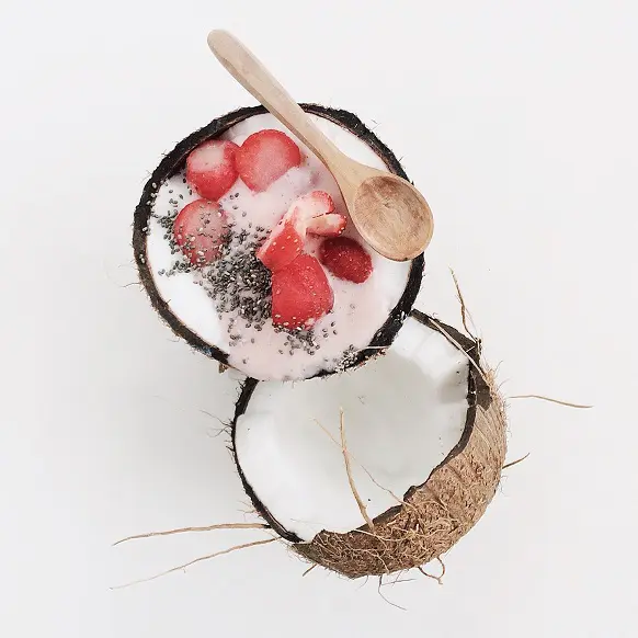
search results:

    • Standard
    • React
    Pricing Learn Community
    • + D
    • Light
    • Dark
    • System
    logo TW Elements
    • Getting started
      • Quick start
      • Tutorials
      • Design system
      • Local installation
      • Optimization
      • Dark mode
      • Theming
      • Changelog
      • Migrating to v2
      • Internationalization guide
      • Class customization
      • Icons Integration
    • CommercialNew
      • Pricing
      • License
      • Installation
      • Git & repository
      • Premium Support
    • Integrations
      • Angular
      • ASP.NET
      • Django
      • Express
      • Laravel
      • Next
      • Nuxt
      • Qwik
      • React
      • Remix
      • Solid
      • Svelte
      • SvelteKit
      • Vue
    • Content & styles
      • Animations
      • Animations Extended
      • Colors
      • Dividers
      • Figures
      • Headings
      • Hover effects
      • Icons
      • Images
      • Mask
      • Shadows
      • Typography
    • Navigation
      • Breadcrumbs
      • Footer
      • Headers
      • Mega menu
      • Navbar
      • Offcanvas
      • Pagination
      • Pills
      • Scrollspy
      • Sidenav
      • Tabs
    • Components
      • Accordion
      • Alerts
      • Avatar
      • Badges
      • Button group
      • Buttons
      • Cards
      • Carousel
      • Chips
      • Collapse
      • Dropdown
      • Gallery
      • Jumbotron
      • Lightbox
      • Link
      • List group
      • Modal
      • Notifications
      • Paragraphs
      • Placeholders
      • Popconfirm
      • Popover
      • Progress
      • Rating
      • Scroll back to top button
      • Social buttons
      • Spinners
      • Stepper
      • Testimonials
      • Timeline
      • Toast
      • Tooltip
      • Video
      • Video carousel
    • Forms
      • Autocomplete
      • Checkbox
      • Datepicker
      • Datetimepicker
      • File input
      • Form templates
      • Input Group
      • Inputs
      • Login form
      • Multi range slider
      • Radio
      • Range
      • Registration form
      • Search
      • Select
      • Switch
      • Textarea
      • Timepicker
      • Validation
    • Data
      • Charts
      • Charts advanced
      • Datatables
      • Tables
    • Methods
      • Clipboard
      • Infinite scroll
      • Lazy loading
      • Loading management
      • Ripple
      • Scrollbar
      • Smooth scroll
      • Sticky
      • Touch
    • Design Blocks
      • Admin Charts
      • Admin Complex
      • Admin Forms
      • Admin Maps
      • Admin Navigation
      • Admin tables
      • Banners
      • Contact
      • Content
      • CTA
      • FAQ
      • Features
      • Headers
      • Hero / Intro sections
      • Logo clouds
      • Mega menu
      • News
      • Newsletter
      • Pricing
      • Projects
      • Stats
      • Stats admin
      • Team
      • Testimonials
    • Tools
      • Button generator
      • Card generator
      • Flexbox generator
      • Footer generator
      • Form builder
      • Grid generator
      • Icon generator
      • Instagram Filters generator
      • Logo generator
      • Table generator
      • Typography generator
    • Coming Soon
      • Angular
      • Builder
      • Templates
      • Vue
    • Resources
      • Playground
      • YouTube Channel
      • Private FB Group
      • Newsletter
      • UI Design course New
      • UI / UX tips
    • Overview
    • API

    Lightbox

    Tailwind CSS Lightbox

    Responsive lightbox built with the latest Tailwind CSS. Lightbox is a responsive gallery with the option to enlarge selected photos.

    Required ES init: Lightbox *
    * UMD autoinits are enabled by default. This means that you don't need to initialize the component manually. However if you are using TW Elements ES format then you should pass the required components to the initTWE method.

    Basic example

    Use these default button styles with multiple colors to indicate an action or link within your website.

    Table Full of Spices
    Winter Landscape
    View of the City in the Mountains
    • HTML
    • javascript
    <div
      data-twe-lightbox-init
      class="flex flex-col space-y-5 lg:flex-row lg:space-x-5 lg:space-y-0 rtl:space-x-reverse">
      <div class="h-full w-full">
        <img
          src="https://mdbcdn.b-cdn.net/img/Photos/Thumbnails/Slides/1.webp"
          data-twe-img="https://mdbcdn.b-cdn.net/img/Photos/Slides/1.webp"
          alt="Table Full of Spices"
          class="w-full cursor-zoom-in data-[twe-lightbox-disabled]:cursor-auto" />
      </div>
      <div class="h-full w-full">
        <img
          src="https://mdbcdn.b-cdn.net/img/Photos/Thumbnails/Slides/2.webp"
          data-twe-img="https://mdbcdn.b-cdn.net/img/Photos/Slides/2.webp"
          alt="Winter Landscape"
          class="w-full cursor-zoom-in data-[twe-lightbox-disabled]:cursor-auto" />
      </div>
      <div class="h-full w-full">
        <img
          src="https://mdbcdn.b-cdn.net/img/Photos/Thumbnails/Slides/3.webp"
          data-twe-img="https://mdbcdn.b-cdn.net/img/Photos/Slides/3.webp"
          alt="View of the City in the Mountains"
          class="w-full cursor-zoom-in data-[twe-lightbox-disabled]:cursor-auto" />
      </div>
    </div>
    // Initialization for ES Users
    import {
      Lightbox,
      initTWE,
    } from "tw-elements";
    
    initTWE({ Lightbox });

    Hey there 👋 we're excited about TW elements and want to see it grow! If you enjoy it, help the project grow by sharing it with your peers. Every share counts, thank you!

    Image optimization

    To ensure the proper performance of the page, it is recommended to include thumbnails of images in the src attribute. Then in the data-twe-img attribute add the path to the image with higher resolution. If the data-twe-img attribute is omitted, the lightbox will display the same image as in the reduced size.

    • HTML
    <img
      src="https://mdbcdn.b-cdn.net/img/Photos/Thumbnails/Slides/1.webp"
      data-twe-img="https://mdbcdn.b-cdn.net/img/Photos/Slides/1.webp"
      alt="Table Full of Spices"
      class="w-full cursor-zoom-in data-[twe-lightbox-disabled]:cursor-auto" />

    Shadows and rounded corners

    You can improve the look of the images by adding shadows and rounded corners.

    Table Full of Spices
    Winter Landscape
    View of the City in the Mountains
    • HTML
    • javascript
    <div
      data-twe-lightbox-init
      class="flex flex-col space-y-5 lg:flex-row lg:space-x-5 lg:space-y-0 rtl:space-x-reverse">
      <div class="h-full w-full">
        <img
          src="https://mdbcdn.b-cdn.net/img/Photos/Thumbnails/Slides/1.webp"
          data-twe-img="https://mdbcdn.b-cdn.net/img/Photos/Slides/1.webp"
          alt="Table Full of Spices"
          class="w-full cursor-zoom-in rounded shadow-sm data-[twe-lightbox-disabled]:cursor-auto" />
      </div>
      <div class="h-full w-full">
        <img
          src="https://mdbcdn.b-cdn.net/img/Photos/Thumbnails/Slides/2.webp"
          data-twe-img="https://mdbcdn.b-cdn.net/img/Photos/Slides/2.webp"
          alt="Winter Landscape"
          class="w-full cursor-zoom-in rounded shadow-sm data-[twe-lightbox-disabled]:cursor-auto" />
      </div>
      <div class="h-full w-full">
        <img
          src="https://mdbcdn.b-cdn.net/img/Photos/Thumbnails/Slides/3.webp"
          data-twe-img="https://mdbcdn.b-cdn.net/img/Photos/Slides/3.webp"
          alt="View of the City in the Mountains"
          class="w-full cursor-zoom-in rounded shadow-sm data-[twe-lightbox-disabled]:cursor-auto" />
      </div>
    </div>
    // Initialization for ES Users
    import {
      Lightbox,
      initTWE,
    } from "tw-elements";
    
    initTWE({ Lightbox });

    Different sizes

    Loaded images can have any aspect ratio. Their size will be automatically adjusted to the window when you open the lightbox.

    Table Full of Spices Coconut with Strawberries
    Dark Roast Iced Coffee
    • HTML
    • javascript
    <div
      data-twe-lightbox-init
      class="flex flex-col space-y-5 lg:flex-row lg:space-x-5 lg:space-y-0 rtl:space-x-reverse rtl:space-y-reverse">
      <div class="flex h-full w-full flex-1 flex-col">
        <img
          src="https://mdbcdn.b-cdn.net/img/Photos/Thumbnails/Slides/1.webp"
          data-twe-img="https://mdbcdn.b-cdn.net/img/Photos/Slides/1.webp"
          alt="Table Full of Spices"
          class="mb-5 w-full cursor-zoom-in data-[twe-lightbox-disabled]:cursor-auto" />
        <img
          src="https://mdbcdn.b-cdn.net/img/Photos/Thumbnails/Square/1.webp"
          data-twe-img="https://mdbcdn.b-cdn.net/img/Photos/Square/1.webp"
          alt="Coconut with Strawberries"
          class="w-full cursor-zoom-in data-[twe-lightbox-disabled]:cursor-auto" />
      </div>
      <div class="flex h-full w-full flex-1 flex-col">
        <img
          src="https://mdbcdn.b-cdn.net/img/Photos/Thumbnails/Vertical/1.webp"
          data-twe-img="https://mdbcdn.b-cdn.net/img/Photos/Vertical/1.webp"
          alt="Dark Roast Iced Coffee"
          class="w-full cursor-zoom-in data-[twe-lightbox-disabled]:cursor-auto" />
      </div>
    </div>
    // Initialization for ES Users
    import {
      Lightbox,
      initTWE,
    } from "tw-elements";
    
    initTWE({ Lightbox });

    Zoom level

    The data-twe-zoom-level attribute allows you to define the size of a single zoom in / zoom out.

    Table Full of Spices
    Winter Landscape
    View of the City in the Mountains
    • HTML
    • javascript
    <div
      data-twe-lightbox-init
      data-twe-zoom-level="0.25"
      class="flex flex-col space-y-5 lg:flex-row lg:space-x-5 lg:space-y-0 rtl:space-x-reverse">
      <div class="h-full w-full">
        <img
          src="https://mdbcdn.b-cdn.net/img/Photos/Thumbnails/Slides/1.webp"
          data-twe-img="https://mdbcdn.b-cdn.net/img/Photos/Slides/1.webp"
          alt="Table Full of Spices"
          class="w-full cursor-zoom-in data-[twe-lightbox-disabled]:cursor-auto" />
      </div>
      <div class="h-full w-full">
        <img
          src="https://mdbcdn.b-cdn.net/img/Photos/Thumbnails/Slides/2.webp"
          data-twe-img="https://mdbcdn.b-cdn.net/img/Photos/Slides/2.webp"
          alt="Winter Landscape"
          class="w-full cursor-zoom-in data-[twe-lightbox-disabled]:cursor-auto" />
      </div>
      <div class="h-full w-full">
        <img
          src="https://mdbcdn.b-cdn.net/img/Photos/Thumbnails/Slides/3.webp"
          data-twe-img="https://mdbcdn.b-cdn.net/img/Photos/Slides/3.webp"
          alt="View of the City in the Mountains"
          class="w-full cursor-zoom-in data-[twe-lightbox-disabled]:cursor-auto" />
      </div>
    </div>
    // Initialization for ES Users
    import {
      Lightbox,
      initTWE,
    } from "tw-elements";
    
    initTWE({ Lightbox });

    Disabled image

    By adding a data-twe-lightbox-disabled attribute to any image, you can exclude it from your lightbox. In the example below, the third image has been disabled.

    Table Full of Spices
    Winter Landscape
    Disabled image
    Place Royale Bruxelles
    • HTML
    • javascript
    <div
      data-twe-lightbox-init
      class="flex flex-col space-y-5 lg:flex-row lg:space-x-5 lg:space-y-0 rtl:space-x-reverse">
      <div class="h-full w-full">
        <img
          src="https://mdbcdn.b-cdn.net/img/Photos/Thumbnails/Slides/1.webp"
          data-twe-img="https://mdbcdn.b-cdn.net/img/Photos/Slides/1.webp"
          alt="Table Full of Spices"
          class="w-full cursor-zoom-in data-[twe-lightbox-disabled]:cursor-auto" />
      </div>
      <div class="h-full w-full">
        <img
          src="https://mdbcdn.b-cdn.net/img/Photos/Thumbnails/Slides/2.webp"
          data-twe-img="https://mdbcdn.b-cdn.net/img/Photos/Slides/2.webp"
          alt="Winter Landscape"
          class="w-full cursor-zoom-in data-[twe-lightbox-disabled]:cursor-auto" />
      </div>
      <div class="h-full w-full">
        <img
          src="https://mdbcdn.b-cdn.net/img/Photos/Thumbnails/Slides/3.webp"
          data-twe-img="https://mdbcdn.b-cdn.net/img/Photos/Slides/3.webp"
          data-twe-lightbox-disabled
          alt="Disabled image"
          class="w-full cursor-zoom-in data-[twe-lightbox-disabled]:cursor-auto" />
      </div>
      <div class="h-full w-full">
        <img
          src="https://mdbcdn.b-cdn.net/img/Photos/Thumbnails/Slides/4.webp"
          data-twe-img="https://mdbcdn.b-cdn.net/img/Photos/Slides/4.webp"
          alt="Place Royale Bruxelles"
          class="w-full cursor-zoom-in data-[twe-lightbox-disabled]:cursor-auto" />
      </div>
    </div>
    // Initialization for ES Users
    import {
      Lightbox,
      initTWE,
    } from "tw-elements";
    
    initTWE({ Lightbox });

    Captions

    Image captions can be added using the data-twe-caption attribute. If it is not set, the data is taken from the alt attribute. When you want to disable caption, leave the data-twe-caption empty.

    Table Full of Spices
    Winter Landscape
    View of the City in the Mountains
    • HTML
    • javascript
    <div
      data-twe-lightbox-init
      class="flex flex-col space-y-5 lg:flex-row lg:space-x-5 lg:space-y-0 rtl:space-x-reverse">
      <div class="h-full w-full">
        <img
          src="https://mdbcdn.b-cdn.net/img/Photos/Thumbnails/Slides/1.webp"
          data-twe-img="https://mdbcdn.b-cdn.net/img/Photos/Slides/1.webp"
          data-twe-caption="Image caption 1"
          alt="Table Full of Spices"
          class="w-full cursor-zoom-in data-[twe-lightbox-disabled]:cursor-auto" />
      </div>
      <div class="h-full w-full">
        <img
          src="https://mdbcdn.b-cdn.net/img/Photos/Thumbnails/Slides/2.webp"
          data-twe-img="https://mdbcdn.b-cdn.net/img/Photos/Slides/2.webp"
          data-twe-caption="Image caption 2"
          alt="Winter Landscape"
          class="w-full cursor-zoom-in data-[twe-lightbox-disabled]:cursor-auto" />
      </div>
      <div class="h-full w-full">
        <img
          src="https://mdbcdn.b-cdn.net/img/Photos/Thumbnails/Slides/3.webp"
          data-twe-img="https://mdbcdn.b-cdn.net/img/Photos/Slides/3.webp"
          data-twe-caption="Image caption 3"
          alt="View of the City in the Mountains"
          class="w-full cursor-zoom-in data-[twe-lightbox-disabled]:cursor-auto" />
      </div>
    </div>
    // Initialization for ES Users
    import {
      Lightbox,
      initTWE,
    } from "tw-elements";
    
    initTWE({ Lightbox });

    Outside access

    The lightbox can be successfully operated via JavaScript. There are many public methods available such as open, slide, zoomIn, zoomOut, or close. All are described in the API tab.

    Table Full of Spices
    Winter Landscape
    View of the City in the Mountains
    • HTML
    • javascript
    • javascript
    <div
      data-twe-lightbox-init
      id="lightbox"
      class="flex flex-col space-y-5 lg:flex-row lg:space-x-5 lg:space-y-0 rtl:space-x-reverse">
      <div class="h-full w-full">
        <img
          src="https://mdbcdn.b-cdn.net/img/Photos/Thumbnails/Slides/1.webp"
          data-twe-img="https://mdbcdn.b-cdn.net/img/Photos/Slides/1.webp"
          data-twe-caption="Image caption 1"
          alt="Table Full of Spices"
          class="w-full cursor-zoom-in data-[twe-lightbox-disabled]:cursor-auto" />
      </div>
      <div class="h-full w-full">
        <img
          src="https://mdbcdn.b-cdn.net/img/Photos/Thumbnails/Slides/2.webp"
          data-twe-img="https://mdbcdn.b-cdn.net/img/Photos/Slides/2.webp"
          data-twe-caption="Image caption 2"
          alt="Winter Landscape"
          class="w-full cursor-zoom-in data-[twe-lightbox-disabled]:cursor-auto" />
      </div>
      <div class="h-full w-full">
        <img
          src="https://mdbcdn.b-cdn.net/img/Photos/Thumbnails/Slides/3.webp"
          data-twe-img="https://mdbcdn.b-cdn.net/img/Photos/Slides/3.webp"
          data-twe-caption="Image caption 3"
          alt="View of the City in the Mountains"
          class="w-full cursor-zoom-in data-[twe-lightbox-disabled]:cursor-auto" />
      </div>
    </div>
    <div class="mt-3 text-center">
      <button
        type="button"
        id="lightboxToggler"
        data-twe-ripple-init
        data-twe-ripple-color="light"
        class="inline-block rounded bg-primary px-6 pb-2 pt-2.5 text-xs font-medium uppercase leading-normal text-white shadow-[0_4px_9px_-4px_#3b71ca] transition duration-150 ease-in-out hover:bg-primary-600 hover:shadow-[0_8px_9px_-4px_rgba(59,113,202,0.3),0_4px_18px_0_rgba(59,113,202,0.2)] focus:bg-primary-600 focus:shadow-[0_8px_9px_-4px_rgba(59,113,202,0.3),0_4px_18px_0_rgba(59,113,202,0.2)] focus:outline-none focus:ring-0 active:bg-primary-700 active:shadow-[0_8px_9px_-4px_rgba(59,113,202,0.3),0_4px_18px_0_rgba(59,113,202,0.2)] dark:shadow-[0_4px_9px_-4px_rgba(59,113,202,0.5)] dark:hover:shadow-[0_8px_9px_-4px_rgba(59,113,202,0.2),0_4px_18px_0_rgba(59,113,202,0.1)] dark:focus:shadow-[0_8px_9px_-4px_rgba(59,113,202,0.2),0_4px_18px_0_rgba(59,113,202,0.1)] dark:active:shadow-[0_8px_9px_-4px_rgba(59,113,202,0.2),0_4px_18px_0_rgba(59,113,202,0.1)]">
        Open second image
      </button>
    </div>
    // Initialization for ES Users
    import {
      Lightbox,
      initTWE,
    } from "tw-elements";
    
    initTWE({ Lightbox });
    
    const lightbox = document.getElementById("lightbox");
    const lightboxInstance = Lightbox.getInstance(lightbox);
    const lightboxToggler = document.getElementById("lightboxToggler");
    
    lightboxToggler.addEventListener("click", () => {
        lightboxInstance.open(1);
    });
    const lightbox = document.getElementById("lightbox");
    const lightboxInstance = twe.Lightbox.getInstance(lightbox);
    const lightboxToggler = document.getElementById("lightboxToggler");
    
    lightboxToggler.addEventListener("click", () => {
        lightboxInstance.open(1);
    });

    Related resources

    Gallery Video carousel Images Carousel Shadows

    If you are looking for more advanced options, try Bootstrap Lightbox from MDBootstrap.

    • Basic example
    • Image optimization
    • Shadows and rounded corners
    • Different sizes
    • Zoom level
    • Disabled image
    • Captions
    • Outside access
    • Related resources

    Lightbox - API


    Import

    Importing components depends on how your application works. If you intend to use the TW elements ES format, you must first import the component and then initialize it with the initTWE method. If you are going to use the UMD format, just import the tw-elements package.

    • javascript
    • javascript
    import { Lightbox, initTWE } from "tw-elements";
    initTWE({ Lightbox });
    import "tw-elements";

    Usage

    Via data attributes

    Using the Lightbox component doesn't require any additional JavaScript code - simply add a div wrapper with a data-twe-lightbox-init attribute and use other data attributes to set all options. For ES format, you must first import and call the initTWE method.

    • HTML
    <div
      data-twe-lightbox-init
      class="flex flex-col space-y-5 lg:flex-row lg:space-x-5 lg:space-y-0">
      <div class="h-full w-full">
        <img
          src="https://mdbcdn.b-cdn.net/img/Photos/Thumbnails/Slides/1.webp"
          data-twe-img="https://mdbcdn.b-cdn.net/img/Photos/Slides/1.webp"
          alt="Table Full of Spices"
          class="w-full cursor-zoom-in data-[twe-lightbox-disabled]:cursor-auto" />
      </div>
      <div class="h-full w-full">
        <img
          src="https://mdbcdn.b-cdn.net/img/Photos/Thumbnails/Slides/2.webp"
          data-twe-img="https://mdbcdn.b-cdn.net/img/Photos/Slides/2.webp"
          alt="Winter Landscape"
          class="w-full cursor-zoom-in data-[twe-lightbox-disabled]:cursor-auto" />
      </div>
      <div class="h-full w-full">
        <img
          src="https://mdbcdn.b-cdn.net/img/Photos/Thumbnails/Slides/3.webp"
          data-twe-img="https://mdbcdn.b-cdn.net/img/Photos/Slides/3.webp"
          alt="View of the City in the Mountains"
          class="w-full cursor-zoom-in data-[twe-lightbox-disabled]:cursor-auto" />
      </div>
    </div>

    Via JavaScript

    • javascript
    • javascript
    const myLightbox = new Lightbox(document.getElementById('lightbox'), options, classes);
    const myLightbox = new twe.Lightbox(document.getElementById('lightbox'), options, classes);

    Options

    Options can be passed via data attributes or JavaScript. For data attributes, append the option name to data-twe-, as in data-twe-caption="".

    Name Type Default Description
    caption String - Defines caption of the image. If not set, the value of alt attribute is taken.
    closeIcon String <svg xmlns="http://www.w3.org/2000/svg" fill="none" viewBox="0 0 24 24" stroke-width="3" stroke="currentColor" class="w-4 h-4"> <path stroke-linecap="round" stroke-linejoin="round" d="M6 18L18 6M6 6l12 12" /> </svg> Defines close icon template of the lightbox.
    container String "body" Allows to set the parent element for the lightbox.
    hideFullscreenIconTemplate String <svg xmlns="http://www.w3.org/2000/svg" fill="none" viewBox="0 0 24 24" stroke-width="3" stroke="currentColor" class="w-4 h-4"> <path stroke-linecap="round" stroke-linejoin="round" d="M9 9V4.5M9 9H4.5M9 9L3.75 3.75M9 15v4.5M9 15H4.5M9 15l-5.25 5.25M15 9h4.5M15 9V4.5M15 9l5.25-5.25M15 15h4.5M15 15v4.5m0-4.5l5.25 5.25" /> </svg> Defines hide fullscreen icon template of the lightbox.
    img String - Defines regular image to load when gallery is open. If not set, the value of src attribute is taken.
    nextIconTemplate String <svg xmlns="http://www.w3.org/2000/svg" fill="none" viewBox="0 0 24 24" stroke-width="3" stroke="currentColor" class="w-4 h-4"> <path stroke-linecap="round" stroke-linejoin="round" d="M3.75 3.75v4.5m0-4.5h4.5m-4.5 0L9 9M3.75 20.25v-4.5m0 4.5h4.5m-4.5 0L9 15M20.25 3.75h-4.5m4.5 0v4.5m0-4.5L15 9m5.25 11.25h-4.5m4.5 0v-4.5m0 4.5L15 15" /> </svg> Defines next icon template of the lightbox.
    prevIconTemplate String <svg xmlns="http://www.w3.org/2000/svg" fill="currentColor" viewBox="0 0 24 24" stroke-width="3" stroke="currentColor" class="w-4 h-4"> <path stroke-linecap="round" stroke-linejoin="round" d="M19.5 12h-15m0 0l6.75 6.75M4.5 12l6.75-6.75" /> </svg> Defines prev icon template of the lightbox.
    showFullscreenIconTemplate String <svg xmlns="http://www.w3.org/2000/svg" fill="none" viewBox="0 0 24 24" stroke-width="3" stroke="currentColor" class="w-4 h-4"> <path stroke-linecap="round" stroke-linejoin="round" d="M3.75 3.75v4.5m0-4.5h4.5m-4.5 0L9 9M3.75 20.25v-4.5m0 4.5h4.5m-4.5 0L9 15M20.25 3.75h-4.5m4.5 0v4.5m0-4.5L15 9m5.25 11.25h-4.5m4.5 0v-4.5m0 4.5L15 15" /> </svg> Defines show fullscreen icon template of the lightbox.
    spinnerContent String "Loading..." Defines the text of a spinner
    zoomLevel Number/String 1 Defines zoom level while zooming in or out.
    zoomInIconTemplate String <svg xmlns="http://www.w3.org/2000/svg" fill="none" viewBox="0 0 24 24" stroke-width="3" stroke="currentColor" class="w-4 h-4"> <path stroke-linecap="round" stroke-linejoin="round" d="M21 21l-5.197-5.197m0 0A7.5 7.5 0 105.196 5.196a7.5 7.5 0 0010.607 10.607zM10.5 7.5v6m3-3h-6" /> </svg> Defines zoom in icon template of the lightbox.
    zoomOutIconTemplate String <svg xmlns="http://www.w3.org/2000/svg" fill="none" viewBox="0 0 24 24" stroke-width="3" stroke="currentColor" class="w-4 h-4"> <path stroke-linecap="round" stroke-linejoin="round" d="M21 21l-5.197-5.197m0 0A7.5 7.5 0 105.196 5.196a7.5 7.5 0 0010.607 10.607zM13.5 10.5h-6" /> </svg> Defines zoom out icon template of the lightbox.

    Classes

    Custom classes can be passed via data attributes or JavaScript. For data attributes, append the class name to data-twe-class, as in data-twe-class-caption="".

    Name Default Description
    caption text-white text-ellipsis overflow-hidden whitespace-nowrap mx-[10px] text-center Defines caption classes of the lightbox.
    captionWrapper fixed left-0 bottom-0 w-full h-[50px] flex justify-center items-center Defines caption wrapper classes of the lightbox.
    closeBtn border-none bg-transparent w-[50px] h-[50px] px-4 text-[#b3b3b3] transition-colors duration-200 ease-in-out hover:text-white focus:text-white motion-reduce:transition-none outline-none Defines close button classes of the lightbox.
    fullscreenBtn border-none bg-transparent w-[50px] h-[50px] px-4 text-[#b3b3b3] transition-colors duration-200 ease-in-out hover:text-white focus:text-white motion-reduce:transition-none outline-none Defines fullscreen button classes of the lightbox.
    gallery invisible fixed left-0 top-0 w-full h-full z-[1100] pointer-events-none opacity-0 bg-[#000000e6] transition-all duration-[400ms] motion-reduce:transition-none Defines gallery classes of the lightbox.
    galleryContent fixed top-[50px] left-[50px] w-[calc(100%-100px)] h-[calc(100%-100px)] Defines gallery content classes of the lightbox.
    galleryCounter flex justify-center items-center px-[10px] mb-0 h-full text-[#b3b3b3] Defines gallery counter classes of the lightbox.
    img absolute left-0 top-0 w-full max-h-full h-auto cursor-pointer pointer-events-auto Defines image classes of the lightbox.
    imgWrapper absolute top-0 left-0 w-full h-full opacity-0 transform scale-[0.25] transition-all duration-[400ms] ease-out pointer-events-none motion-reduce:transition-none motion-reduce:transform-none Defines image wrapper classes of the lightbox.
    leftTools float-left h-full Defines left tools classes of the lightbox.
    loader fixed left-0 top-0 z-[2] w-full h-full text-neutral-50 opacity-1 flex justify-center items-center pointer-events-none transition-opacity duration-[1000ms] motion-reduce:transition-none Defines loader classes of the lightbox.
    nextBtn border-none bg-transparent w-full h-[50px] flex justify-center items-center text-[#b3b3b3] transition-colors duration-200 ease-in-out hover:text-white focus:text-white motion-reduce:transition-none outline-none Defines next button classes of the lightbox.
    nextBtnWrapper fixed right-0 top-0 w-[50px] h-full flex justify-center items-center transition-opacity duration-[400ms] motion-reduce:transition-none Defines next button wrapper classes of the lightbox.
    prevBtn border-none bg-transparent w-full h-[50px] flex justify-center items-center text-[#b3b3b3] transition-colors duration-200 ease-in-out hover:text-white focus:text-white motion-reduce:transition-none outline-none Defines prev button classes of the lightbox.
    nextBtnWrapper fixed left-0 top-0 w-[50px] h-full flex justify-center items-center transition-opacity duration-[400ms] motion-reduce:transition-none Defines prev button wrapper classes of the lightbox.
    rightTools float-right Defines right tools classes of the lightbox.
    spinner inline-block h-8 w-8 animate-[spinner-grow_0.75s_linear_infinite] rounded-full bg-current align-[-0.125em] motion-reduce:animate-[spinner-grow_1.5s_linear_infinite] Defines spinner classes of the lightbox. Spinner is visible when image is loading.
    spinnerContent !absolute !-m-px !h-px !w-px !overflow-hidden !whitespace-nowrap !border-0 !p-0 ![clip:rect(0,0,0,0)] Defines spinner content classes of the lightbox.
    toolbar absolute top-0 left-0 w-full h-[50px] z-20 transition-opacity duration-[400ms] motion-reduce:transition-none Defines toolbar classes of the lightbox.
    vertical h-full max-h-full w-auto Defines vertical classes of the lightbox. Vertical class is added when image height is greater than image width.
    zoomBtn border-none bg-transparent w-[50px] h-[50px] px-4 text-[#b3b3b3] transition-colors duration-200 ease-in-out hover:text-white focus:text-white motion-reduce:transition-none outline-none Defines zoom button classes of the lightbox.

    Methods

    Method Description Example
    close Closes the gallery. myLightbox.close()
    dispose Removes the Lightbox instance. myLightbox.dispose()
    getOrCreateInstance Static method which returns the lightbox instance associated to a DOM element or create a new one in case it wasn't initialized. myLightbox.getOrCreateInstance(element)
    getInstance Static method which allows to get the lightbox instance associated with a DOM element. myLightbox.getInstance(element)
    open Opens the gallery and activates image set by the target key. Default is the first image. myLightbox.open(1)
    reset Resets changed parameters such as position, zoom or fullscreen. myLightbox.reset()
    slide Slides an image in the gallery. Available options: left, right, first, last. Dafault is right direction. myLightbox.slide('last')
    toggleFullscreen Toggles fullscreen. myLightbox.toggleFullscreen()
    zoomIn Zooms in active image by one level. myLightbox.zoomIn()
    zoomout Zooms out active image by one level. myLightbox.zoomOut()
    • javascript
    • javascript
    const myLightboxEl = document.getElementById('myLightbox');
    const myLightbox = new Lightbox(myLightboxEl);
    myLightbox.open(1);
    const myLightboxEl = document.getElementById('myLightbox');
    const myLightbox = new twe.Lightbox(myLightboxEl);
    myLightbox.open(1);

    Events

    Event type Description
    open.twe.lightbox Emitted when a lightbox starts opening.
    opened.twe.lightbox Emitted when a lightbox is opened.
    slide.twe.lightbox Emitted when a lightbox starts sliding.
    slid.twe.lightbox Emitted after an image slide.
    zoomIn.twe.lightbox Emitted when an image starts zooming in.
    zoomedIn.twe.lightbox Emitted after an image is zoomed in.
    zoomOut.twe.lightbox Emitted when an image starts zooming out.
    zoomedOut.twe.lightbox Emitted after an image is zoomed out.
    close.twe.lightbox Emitted when a lightbox starts closing.
    closed.twe.lightbox Emitted when a lightbox is closed.
    • JavaScript
    const myLightbox = document.getElementById('lightbox');
    myLightbox.addEventListener('open.twe.lightbox', (e) => {
      // do something...
    });
    • Import
    • Usage
    • Options
    • Classes
    • Methods
    • Events
    Get useful tips & free resources directly to your inbox along with exclusive subscriber-only content.
    Join our mailing list now
    © 2024 Copyright: MDBootstrap.com

    Access restricted

    To view this section you must have an active PRO account

    Log in to your account or purchase an TWE subscription if you don't have one.

    Buy TWE PRO
    Loading...

    Loading...

    Loading...

    Loading...

    Loading...

    Loading...

    Loading...